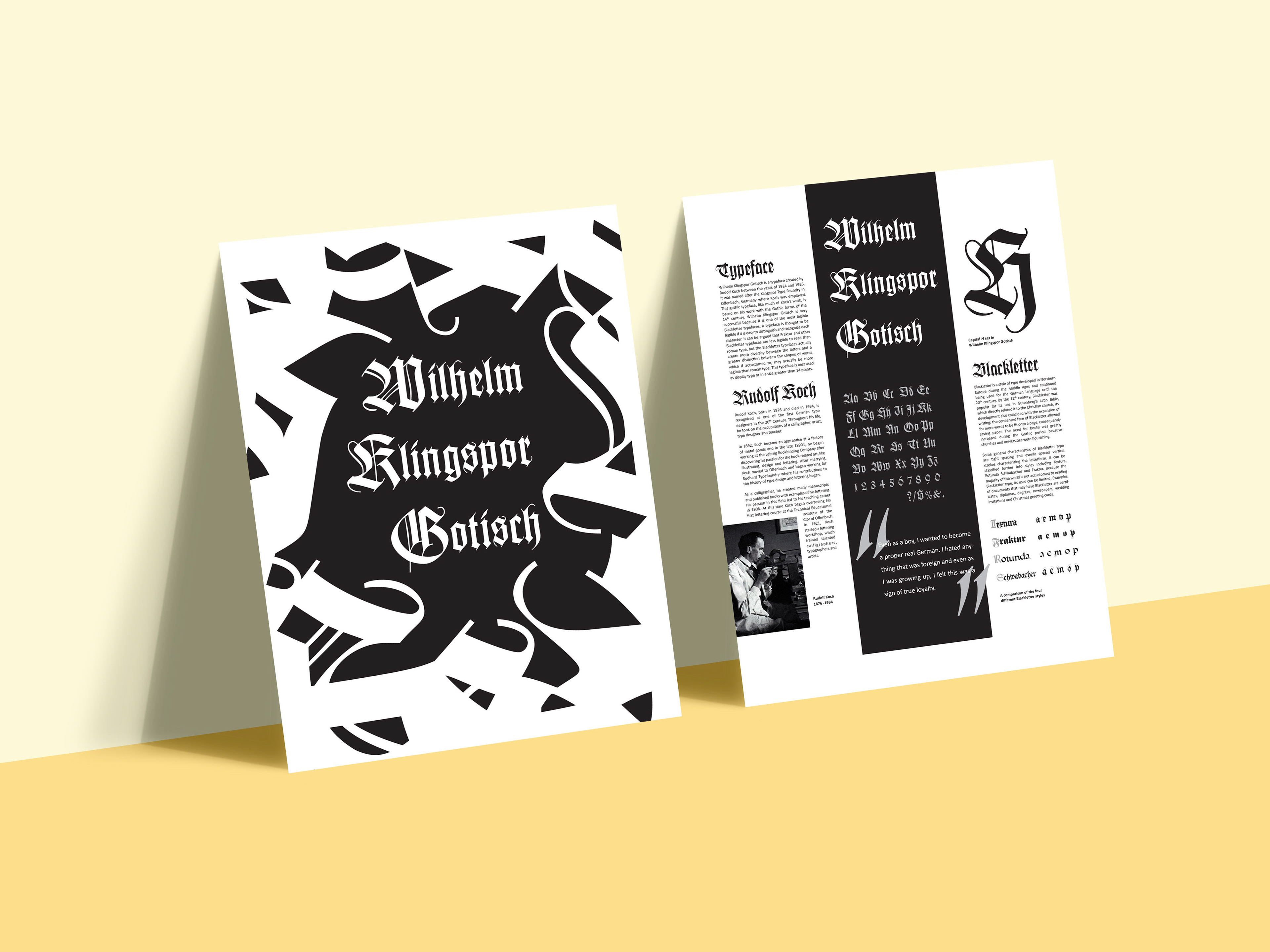

For this class assignment, we were instructed to create a double-sided poster that on one side, illustrated the specific characteristics of our chosen typeface that made it unique and on the other side, display our research of the history of the typeface and its type designer. For the conceptual (front) side of the final design, I focused on emphasizing the illustrative and decorative strokes of Wilhelm Klingspor Gotisch by creating a visual form from the characters. I used the black and white to create contrast between the interesting shapes of the forms and attract the viewer’s eye. On the informational (back) side of this poster, I focused on reflecting the feeling of the front side of the poster while maintaining an organized grid of information.